Why All Logos In 2019 Look The Same


When it comes to design, "bold" is the word of 2019, for sure. It's been an exciting year for some big companies which all decided to show the evolution of corporate identity through a logo.
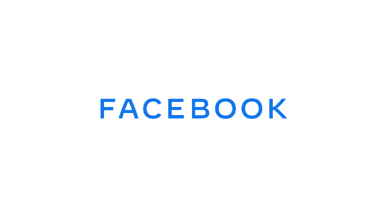
You're certainly not crazy if you think all logos look the same. Apparently most big brands are using the same elements in order to serve a trendy, minimalistic, millennial vibe AND authority at the same time. The special recipe includes Sans-Serif Fonts, ALL CAPS, gradients, andflat appearance.
Stay Bold And Write In Sans-Serif Fonts
You may notice that all logos now have a bold look with a geometric sans-serif touch. But why?
Sans-serif is the coolest Sans sister. These "Brandon Grotesque" fonts feel somehow generic but are surely easier to read. Nowadays, all companies are fighting for attention and screen time. That's why users should read and understand everything brands have to say ASAP. Plus, the roundness of Sans-serif fonts keeps the audience closer to the feeling of perfect shape and infinity.
ALL CAPS - NO, I'M NOT MAD AT YOU, JUST COME HERE AND TRUST ME

Hello, It's Gradient - Y'all Remember Me?
We Are All Flat In Here
How Look-a-Likes Help Business On A Psychological Level
New Microsoft Edge Logo looks a lot like Firefox, inverted and rotated 180°. Well done, designers. pic.twitter.com/gEkmw1g0ol
— T❘LM△N (@Tilman) November 2, 2019
Why do all brands look the same?
Logo redesign is a natural step forward for companies' modernization, mainly lead by trends. A few years ago "Flat Design" went in and now everyone is aiming to reach the highest possible form of simplicity. However, when a brand undergoes change, the process of establishment requires a lot of time and consideration. Big company products have mastered simpler and minimalistic visions in their products so it's quite logical for the design flow to follow.
As you may have seen all apps are unified around flatter and simpler looks. You have to follow this trend if you don't want to be outdated.
It's a cycle and there will always be companies that breakthrough with an innovative design. After all, don't forget that customers are the ones dictating fashion.
Take a look at Snapchat - they want to stand out and their audience is mostly teenagers. They are betting on more playful designs as in their whole brand and logo. When they were changing their logo they went to a different direction fitting their products' needs such as bolder lines, higher contrast and overall, bold vision.
Trends are here to follow and there's nothing bad in everyone's unification. Thus new companies can stand out with a different design - something big companies can't afford because they are targeted among mass audiences."
TL;DR: Most of the time of our dynamic lives are consumed by the Internet. We receive so much information online that our brain is looking for help to absorb and process new information easier and faster. Minimalist design trends comply with our needs of today and tomorrow. If big companies want to stay relevant, they have to follow all working design trends in order to appear more appealing to the average user.